
The city of Vienna, Austria is a thriving metropolis of almost 2 million people. It has long had a well developed public transportation system that includes rail, trolley and bus. The rail system had trolley and light rail lines going back over 100 years.
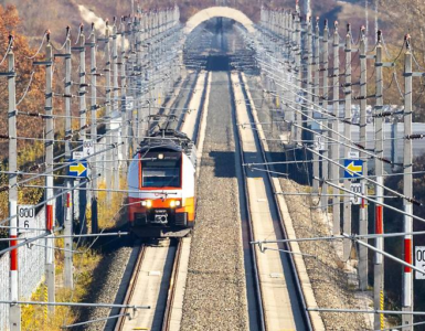
 Old School Subway


In the 1970s, the city of Vienna began a long term project to modernize and expand the system. New lines were planned and constructed, while old lines were upgraded, and some trolley lines were replaced with subways. As of 2013, the major phases of this development were complete with five subway criss-crossing the city.
The Tableau visualization below is a study in mapping geographic point data in combination with Tableau’s path order function. The path order tells Tableau how to connect points which, in this case, allows us to visualize the stations along a subway line. Individual lines are defined by dropping the line name on color.
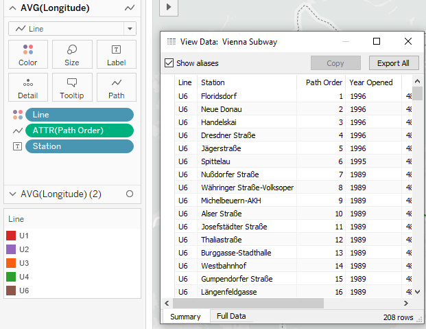
The final touch was to do a dual axis so that one set of points could be shown as a path, while another set of the same points could display the individual stations. Interact with the map to learn more about the different subway, and download the workbook to see how the visualization was built.


Add comment