
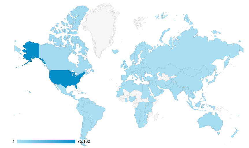
Maps4Kids.com has been around for about 7 years now, Like most web sites, I use Google Analytics to see where my visitors come from, and what pages they seem to like and use the most. This blog post will show the neat mapping function in Google Analytics and how it can tell stories through the maps it produces. For this case, I will be looking at the last 100,000 visits to Maps4Kids.com. If we start with a global view, we see that visitors came from over 160 countries. 75% of the visitors came from the United States, while 25% came from other countries. The top six countries all have English as a mother tongue or a language of instruction – these countries are The United Kingdom, Canada, Australia, India and Ireland. Now, the color gradient representing the number of visits is a little simple in Google Analytics so I may use Tableau Software to show this next time. Tableau Public is a lite, free version of the product. The countries shaded in grey are ones where no one has visited Maps4Kids.com.
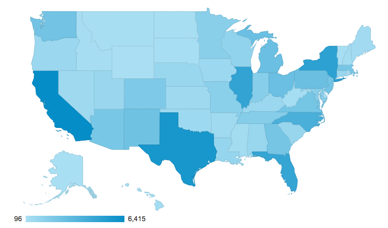
Google Analytics allows you to zoom in and view more localized data as well as viewing the data in points as well as filled areas. This next map shows the visits by state within the United States. As one might expect, the darker colored states with the most visits are pretty much the states that have the largest population. California, Texas, Florida, New York and Illinois are the clear leaders.
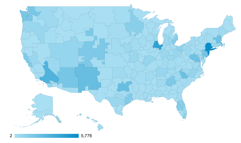
As we dive deeper into the data, we can view the metropolitan area that the visitors are coming from. Again, all areas of the United States are represented but really large urban areas like New York, Chicago and Los Angeles lead the way. When you look at this map, it’s a little hard to understand the borders since we rarely think of the shapes of metropolitan areas like we think of the shape of states. One of our most popular pages is one with downloadable outline maps of states and countries. School projects don’t usually look for metropolitan area maps.
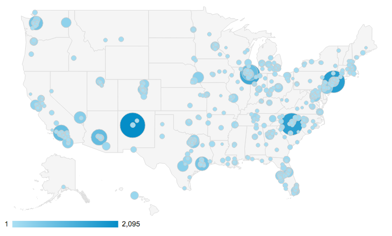
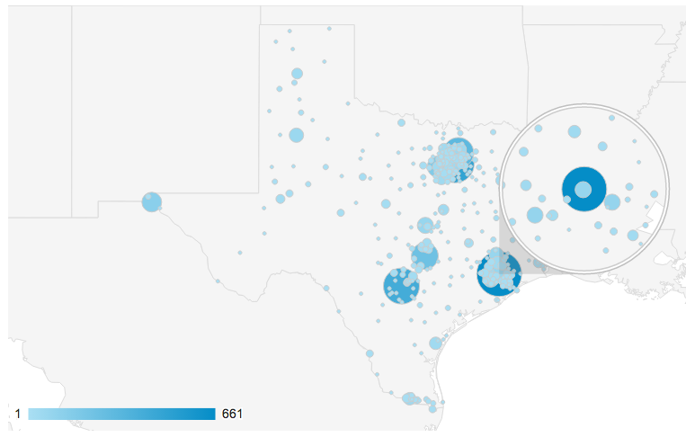
Our final images show maps with points of data. The color and size of the circles both represent the number of visits from those cities. There are some surprises in this map, as Albuquerque, NM, Charlotte, NC and South Holland, IL are right up there in the Top 5 with New York and Chicago. South Holland is a small town about 20 miles south of Chicago and you can read about it on Wikipedia by clicking the link at the beginning of this sentence.
This second one shows the city view for state of Texas, with the Houston area magnified.
Enjoy these maps and let me know if you would like to see the data presented any other way !


Add comment