

 maps4kids team
Have you ever looked at a world map and wondered why Greenland looks almost as big as Africa?
There is a surprising answer. It isn’t !
Africa is about 14 times larger than Greenland. Yet on the familiar world map found in many classrooms, Greenland can look almost the same size as the entire African continent.
So why does this happen?
The answer is something called the Mercator projection. It is one of the most famous maps in history. It was created more than 450 years ago, and it was designed for a very good reason. But today, many people think we should use a different kind of map when we want to compare the true sizes of continents.
And that debate reached the United Nations in 2026.
What Is the Mercator Projection?
First, let’s solve a big problem. The earth is round. Maps are flat.
Imagine trying to peel an orange and then flatten the peel onto a sheet of paper. It would be impossible to make the peel lie perfectly flat without stretching, squashing, or tearing it.
The same thing happens when cartographers — people who make maps — turn our round planet into a flat map.
There is no perfect world map and every projection has to make some compromises.
The Mercator projection was created by the Flemish mapmaker Gerardus Mercator in 1569. He wanted to make a map that was especially useful to sailors traveling across oceans.
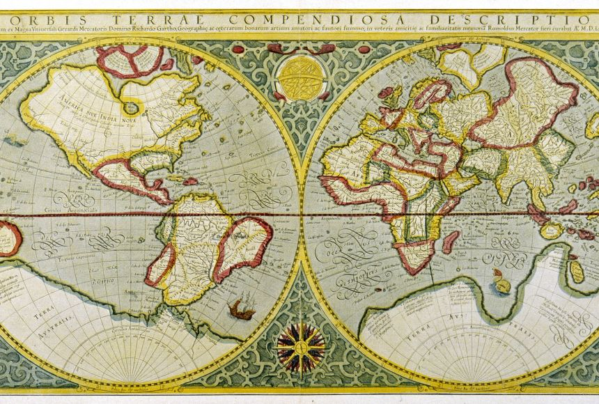
And he succeeded.
The Mercator projection has an amazing feature: a sailor following a constant compass direction could draw that course as a straight line on the map. That made the projection extremely useful for navigation. So Mercator wasn’t trying to trick anyone. He was solving a difficult problem.
Why Does the Mercator Map Make the Poles Look So Big?
This is where things get interesting. Think about the Earth as a ball.
At the Equator, the Earth is widest. If you travel east or west along the Equator, you are traveling around the biggest possible circle on Earth.
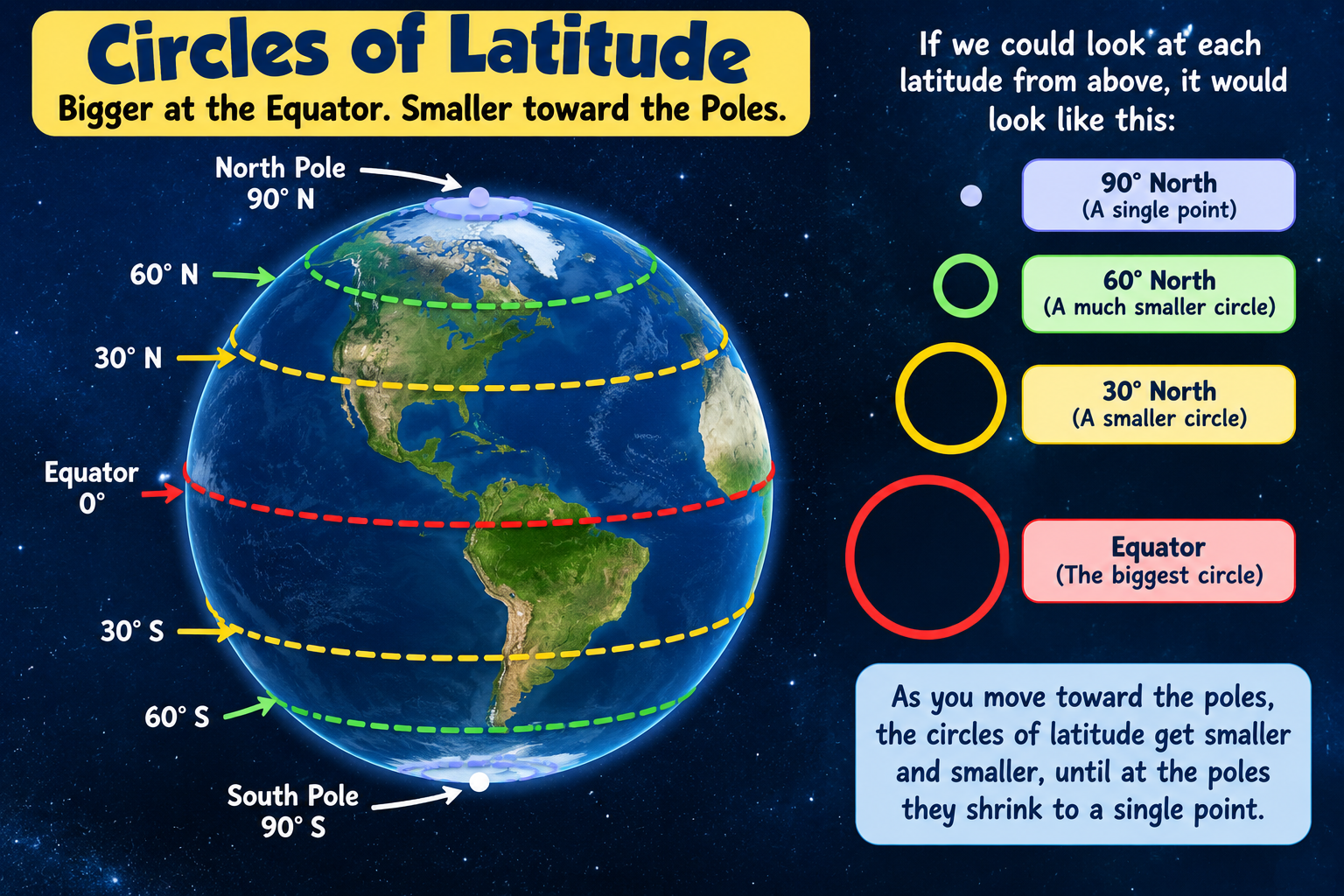
Now move toward the North or South Pole. The circles of latitude become smaller. At the North Pole, the circle has shrunk to a single point.
You can picture it like this:
Equator → big circle
30° north → smaller circle
60° north → much smaller circle
90° north → a point
On a globe, that makes perfect sense.
But Mercator’s map needs its lines of longitude to remain parallel. It also needs the angles and shapes of small areas to remain useful for navigation. To accomplish this, the map stretches the world more and more as you move toward the poles.
The lines of latitude are therefore placed farther apart as you approach the top and bottom of the map. That stretching makes northern and southern regions appear much larger than they really are. This is why Greenland looks enormous.

It isn’t because Greenland actually grew. The map stretched it.
So Is the Mercator Map Wrong?
Well… yes and no.
For showing the relative size of countries and continents, Mercator can be very misleading. On the following map, the Mercator size of countries is in blue while the Actual Size of countries is shown in red.
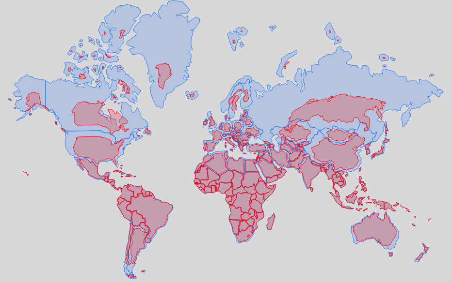
But that doesn’t mean it is a bad map. The problem comes when we look at a Mercator map and assume that the sizes we see are the actual sizes of countries.
They aren’t, and this is an important geography lesson:
A map can be useful without being accurate in every way.
Africa vs. Greenland: A Huge Surprise
Here’s one of the easiest ways to understand the problem. On a typical Mercator map, Greenland can look about as large as Africa.
But in reality:
- Africa: about 30.4 million square kilometers
- Greenland: about 2.2 million square kilometers
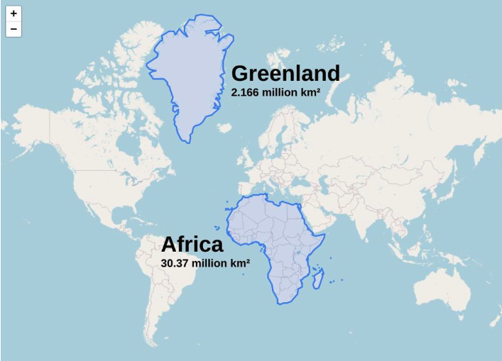
Africa is roughly 14 times larger. That’s a gigantic difference!
The same problem affects other places.
Northern countries and regions such as Canada, Russia and parts of Europe appear much larger than they really are. Meanwhile, areas closer to the Equator, including much of Africa, South America and Southeast Asia, appear relatively smaller.
A New Map: Equal Earth
Cartographers have created many different map projections to solve different problems.
One newer projection is called Equal Earth.
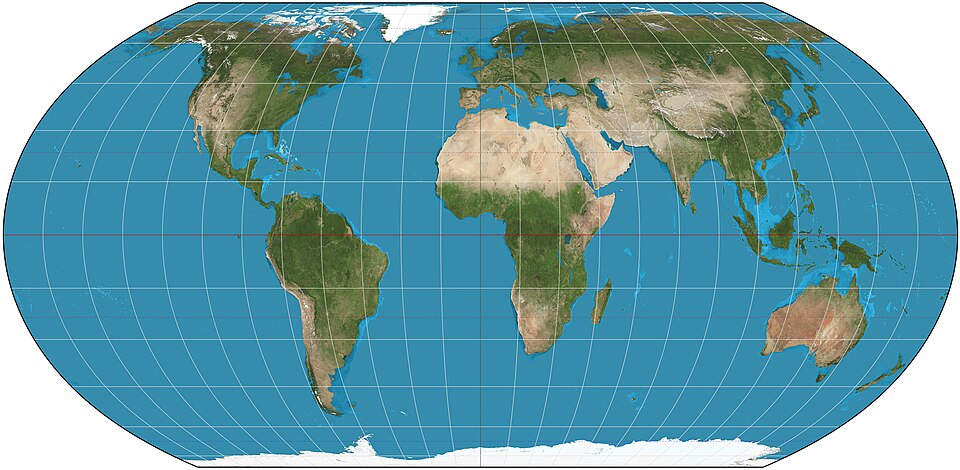
It was developed in 2018 by cartographers Tom Patterson, Bojan Šavrič and Bernhard Jenny. Equal Earth is designed to preserve the relative areas of continents and countries much better. That means Africa looks much closer to its real size compared with Europe or Greenland.
But there is a trade-off. Equal Earth doesn’t preserve everything perfectly. The shapes of some places become slightly different.
And that’s the great thing about mapmaking:
There is no perfect map. Different maps are good for different jobs.
The United Nations Gets Involved
In September 2026, the debate over world maps became international news.
The United Nations General Assembly approved a resolution encouraging countries and organizations to move toward maps that show the relative sizes of continents more accurately.
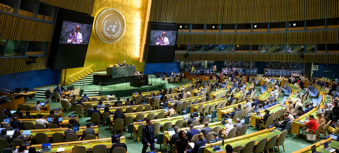
The campaign was led by Togo and supported by the African Union.
The vote was:
164 countries in favor, 6 abstentions, 1 country against
The one country voting against the resolution was the United States.
The resolution promotes Equal Earth and other equal-area projections for situations where showing the true size of land areas is important. But there is an important detail.
The United Nations did not make the Mercator projection illegal. It didn’t order every map in the world to be thrown away. The resolution is non-binding, which means countries aren’t legally required to follow it. Instead, it encourages schools, governments, organizations and technology companies to consider more accurate maps.
Why Did the United States Vote Against It?
This is perhaps the most surprising part of the story. You might think the United States voted against the resolution because the United States looks smaller on an equal-area map. But that isn’t the official reason.
The United States government argued that the UN was spending its time on an ideological issue rather than on more important international problems. American officials also objected to language in the campaign involving ideas such as “cognitive justice” and historical inequalities.
In other words, the disagreement wasn’t really about whether Greenland is actually 14 times smaller than Africa. Everyone agrees on the geography.
The disagreement was about whether the United Nations should be involved in encouraging a particular way of showing that geography.
That’s an important distinction. Two people can agree on the facts but disagree about what should be done about them.
Can a Map Change How We See the World?
This is where geography becomes really fascinating. Imagine seeing the same classroom map every day for ten years.
Europe looks fairly large. North America looks large. Greenland looks enormous. Africa looks smaller.
Eventually, those visual impressions can become part of how you imagine the world. Supporters of the UN resolution argue that maps can influence how people think about countries and continents. Critics argue that a map projection is simply a mathematical tool and shouldn’t be treated as a political statement. There is probably some truth in both arguments.
A map doesn’t change the Earth.
But it can change how the Earth looks to us.
So Which World Map Should We Use?
The best answer is:
It depends on what you are trying to do.
Want to navigate a ship? A Mercator projection can be extremely useful.
Want to compare the actual sizes of continents? An equal-area projection such as Equal Earth is much better.
Want to see what Earth really looks like? Look at a globe!
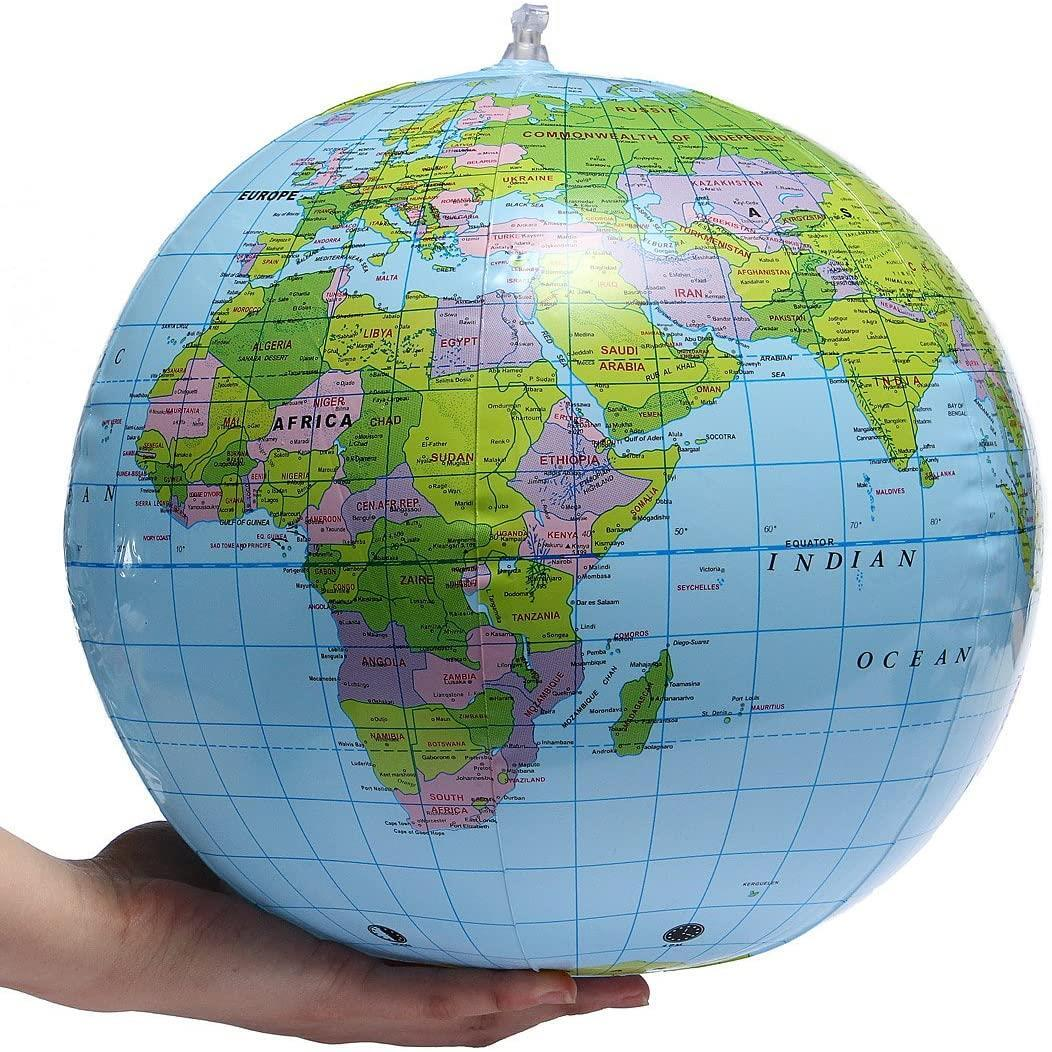
A globe doesn’t have to flatten the Earth onto a sheet of paper, so it avoids many of the problems that map projections create.
The next time you look at a world map, don’t immediately ask, “Is this map right?”
Instead, ask:
“What was this map designed to do?”
That’s the real lesson of the Mercator projection.
Maps aren’t the Earth.
They are pictures of the Earth — and every picture makes choices.
Articles:
United Nations story: https://news.un.org/en/story/2026/09/1168284

Add comment